
Another Brand Logo Is in the Crosshairs. This Time, It’s Spotify.
New Today: Even a temporary app icon change can spark a full-scale internet backlash — and Spotify’s disco-ball logo is the latest example.
Spotify’s disco-ball logo was supposed to feel like a celebration.
Instead, it became another reminder that when brands tamper with familiar visual assets, the internet tends to take it personally.
Last week, Spotify temporarily swapped its iconic green app logo for a glittery disco-ball version as part of its 20th anniversary “Your Party of the Year(s)” campaign. The update was tied to a nostalgic retrospective experience designed to celebrate users’ listening history and Spotify’s broader anniversary rollout.
Internally, the move likely felt playful and low-risk. Spotify has previously discussed adapting its branding during major cultural moments, particularly around campaigns like Wrapped. But online, the reaction landed very differently.
Almost immediately, users across X, TikTok, Reddit, Instagram, Facebook, Threads, and Bluesky began criticizing the new icon. Some described it as ugly or distracting. Others joked that the app looked like it was stuck updating on their phones. Within days, Spotify publicly acknowledged the backlash, posting that “glitter is not for everyone” and confirming the original icon would return.
At PeakMetrics, we used Smart Categories, our AI-powered narrative analysis technology that automatically parses conversations by themes, tones, narratives, sentiment shifts, and contextual signals, to analyze posts across platforms and understand how the Spotify backlash evolved online.
Want to learn more about Smart Categories and how organizations are using them to uncover deeper insights from online conversations? Book a demo with the PeakMetrics team.
The Conversation Skewed Heavily Negative
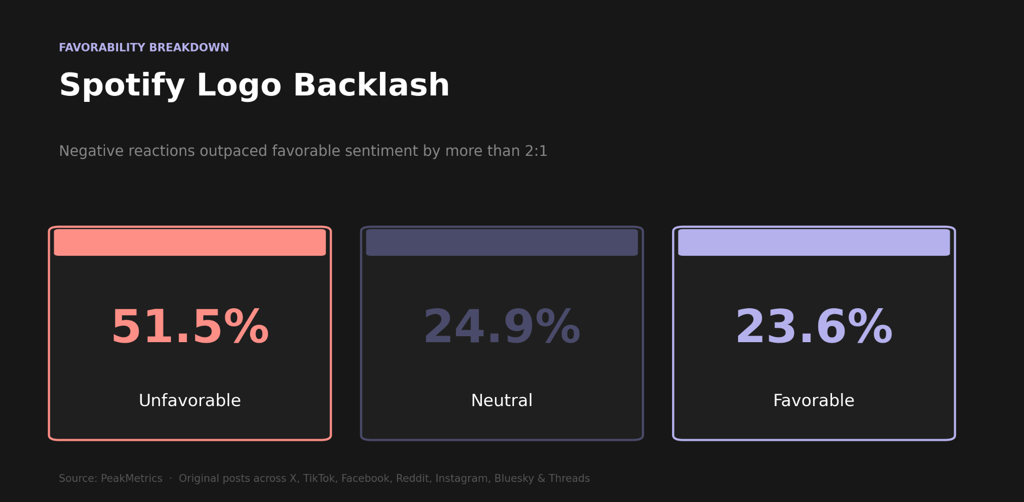
Among original posts related to the Spotify logo update:
51.5% were unfavorable
24.9% were neutral
23.6% were favorable
Negative reactions outpaced positive ones by more than 2:1.
The findings reinforce something brands continue learning online: people become deeply attached to highly familiar visual assets, especially ones they interact with daily. App icons are no longer just branding. They become habits, shortcuts, and part of users’ digital routines.
What People Were Actually Talking About
Using Smart Categories, we parsed the conversation into thematic buckets to understand what was actually driving engagement across platforms.
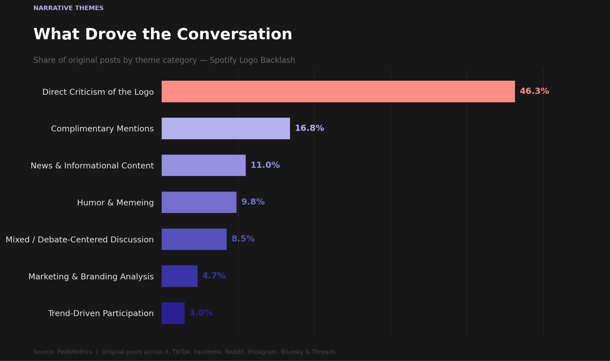
Direct Criticism of the Logo (46.3%)
The largest theme by far centered around direct dissatisfaction with the disco-ball design itself.
Many users criticized:
the icon feeling visually cluttered
difficulty recognizing the app quickly
confusion around whether Spotify was updating
the logo feeling cheap or off-brand
This category overwhelmingly drove the broader negative sentiment surrounding the update.
Complimentary Reactions (16.8%)
Not everyone disliked the change.
A meaningful portion of users appreciated the playful, celebratory feel and defended Spotify for experimenting with its branding. Many supportive posts also emphasized that the update was temporary and tied to Spotify’s anniversary campaign.
News & Informational Discussion (11%)
A sizable portion of the conversation came from creators, media accounts, and informational pages documenting both the backlash and Spotify’s response.
These posts helped accelerate awareness of the controversy beyond the initial wave of reactions and extended the lifecycle of the narrative across platforms.
Humor & Memes (9.8%)
As expected, the internet quickly turned the logo discourse into meme content.
Users compared the icon to:
apps stuck downloading
glitter filters
fake Spotify clones
outdated nightclub branding
The meme layer helped transform the backlash from straightforward criticism into participatory internet culture.
Mixed or Debate-Centered Discussion (8.5%)
Another segment of users engaged in broader debates around branding, consumer reactions, and whether audiences were overreacting to a temporary campaign asset.
Many of these discussions focused less on the logo itself and more on internet outrage culture and how emotionally attached users become to familiar digital experiences.
Marketing & Branding Analysis (4.7%)
Marketing professionals, designers, and branding commentators also weighed in on what the backlash revealed about consumer psychology and brand recognition.
These conversations focused on:
emotional attachment to familiar brand assets
app icon recognition behavior
the risks of altering highly habitual visual systems
how temporary branding changes can quickly escalate online
Trend-Driven Participation (3%)
Some brands, creators, and users joined the conversation opportunistically through trend-driven content creation.
This included parody logos, reaction content, and engagement-driven posts that used the Spotify discourse as a broader social trend rather than participating directly in the branding debate itself.
Bots in the Room
One of the more interesting findings in the analysis was the role likely bot-driven activity played in shaping the broader conversation.
Nearly 30% of the discussion surrounding the Spotify logo change showed signs of likely bot activity.
However, unlike many online controversies where suspected bots amplify outrage, the Spotify conversation revealed a different pattern.
Posts rated as “Almost Certain” bot activity skewed more neutral or favorable than negative. Many of these accounts amplified:
Spotify’s explanation of the logo change
reminders that the update was temporary
Spotify’s acknowledgment of backlash
support for the branding direction
Overall, the findings suggest that highly suspected bot activity contributed more to neutralizing or balancing the discourse than intensifying criticism.
The Bigger Takeaway
Spotify’s disco-ball logo may have only been temporary, but the reaction to it underscores something much larger about modern branding in the social era.
Logos are no longer just design systems or marketing assets. On phones, apps, and platforms, they become habits. Shortcuts. Daily touchpoints people interact with constantly.
And when those assets change, even briefly, audiences react emotionally.
What’s notable here, though, is that the backlash largely stayed contained within branding and internet culture discourse. Because the logo was clearly tied to a temporary anniversary marketing campaign rather than a broader values-based rebrand, the conversation never spiraled into the kind of politicized narrative environment we’ve seen with other recent brand controversies, including Cracker Barrel.
The internet still got mad.
But this time, it mostly stayed about the logo.